When I realized how much I liked colors and design, I started learning a little bit about color theory. I started by just researching some color theory basics. Here are a few things I learned:
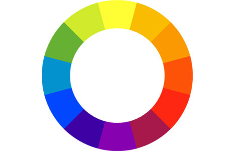
This is a color wheel. First designed in the 1660s, it provides a model to help artists create color palletes and figure out what colors look best together. The colors on the wheel can be split into three different categories:
A basic colorwheel
The secondary colors can be made using the primary colors and the tertiary colors can be made using the primary colors and the secondary colors. We see this when red and blue combine to make purple, yellow and blue combine to make green, and red and yellow combine to make orange.
When looking for a color scheme, there are three different types of color combinations. There are complementary, analogous, and triadic colors. Complementary colors are colors that are across from each other on the wheel. For example, yellow and purple are complementary. Analogous colors are colors that are next to each other on the wheel, like yellow, yellow-orange, orange, and red. Finally, triadic colors are evenly spaced colors on the wheel that complement each other while letting each pop on their own. The simplest example of triadic colors is red, yellow, and blue.
Another topic I found interesting was color psychology because I didn't realize how powerful color was in marketing. The table below shows the psychology and the emotions that different colors invoke along with when to use the colors.
| Color Psychology | ||||||
|---|---|---|---|---|---|---|
| Red | Orange | Yellow | Green | Blue | Purple | |
| Psychology | Associated with excitement, youthfulness, energy, love, anger | Associated with warmth, enthusiasm, fun, happiness, caution | Associated with optimism, cheerfulness, fear, anxiety | Associated with nature, growth, money, luck, envy | Associated with loyalty, calmness, reliability, sadness | Associated with creativity, wisdom, luxury, courage, magic |
| When to use | To call attention to something (food, fashion, health care) | To highlight a call to action (sports, games, child care) | To energize or call out (bright) or create a calmer effect(pastel) | To create a calming effect (nature, tourism, restaurants) | To show trust and productivity (medical, science, legal) | To communicate intrigue and mystery (astrology, healing, spirituality) |